
No business can deny the importance of effective User Experience (UX) in website design and performance. Therefore it’s only natural companies are on the hunt for tools to help optimise their website from a UX perspective.
One such tool often underutilised are heat maps, which provide visual representations of customer behaviour when browsing a website. So, how can heatmaps benefit UX?
What are Heat Maps?
As their name suggests, heat maps utilise colours to highlight customer interaction with a website, ranging from red (extremely high usage) to dark blue (extremely low usage). However, within heat maps there are a number of different performance metrics which highlight different aspects of customer behaviour. We’ll explain these further below:
1. Click Heat Map
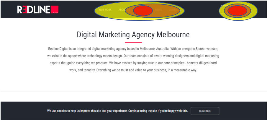 The image above shows a basic mock-up of a typical click heat map. As can be seen the majority of clicks surround the main navigation bar including “our work”, “services” and “contact us”. There are also a few clicks in this area highlighted by the yellow and orange. The red circles over the “services” part of the navigation and “enquire now” show a high volume of clicks on each of those navigation items. If there wasn’t a high volume of clicks in on these nav items, this could cause a potential issue that would need investigation. You can also drill down to see the number of clicks on each nav item for further detail if need be.
2. Move/Hover Heat Map
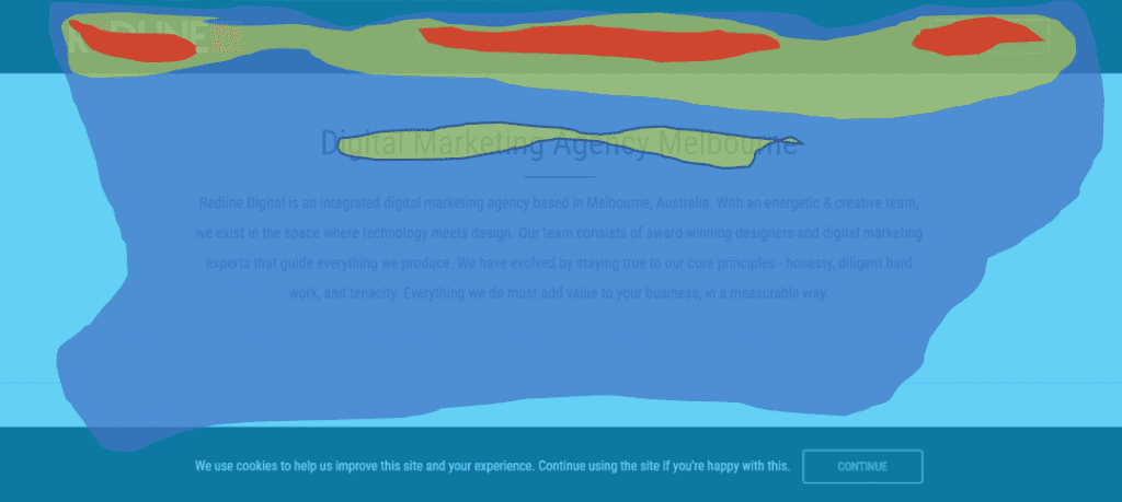 This next image is an example of the move/hover heat map. As the name suggests the heat map shows an overlay of multiple users typical mouse movement while viewing the page. Here we can see there is a high volume of movement over the navigation bar compared to other areas, showing that individuals are moving the mouse of each of these individual buttons. This might also bring cause to drive more CTA elements in the header banner as a way of engaging visitors.
3. Scroll Heat Map
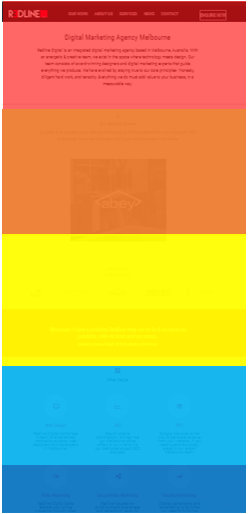
The aim of scroll heatmaps is to demonstrate how far customers/clients typically scroll down on your webpage. The areas with the hotter colours (yellow upwards to red) show a higher amount of viewership while the cooler colours (light blue to dark blue) show the areas that are less often scrolled down to.
Benefits of Heat Maps
From investigating the three examples of heat maps above, we can already some obvious benefits of using them. Now let’s explore how these insights can be utilised to provide greater analysis and help you implement worthwhile UX updates.
Testing Design Elements
It is important that UX updates are tested to see if they work effectively. Implementing different website features and trialing these over a designated period can be analysed using heat maps to find out how customers interact with the different changes. Essentially allowing for heat map A/B testing.
This can then be further explored through session recordings. These recordings allow you to track the movement of individual visitors during sessions. Meaning businesses can see the exact mouse movement of an individual, providing for a real representation of website usability from the perspective of a prospective customer. Allowing for further examination and tweaks of design and layout elements.
Website Redesigns
When undertaking website redesigns, some companies tend to give their website a facelift based off current UI trends in the industry. While this may look good, it may not actually add any tangible benefits from a user experience and conversion optimisation perspective, and in some cases can actually have a negative effect on website performance. Therefore, it is usually recommended that businesses look to update their website focused on pain points and any prominent areas that particularly need updating. This is where heat maps can be especially insightful, as they can point out specific issues that need to be updated and highlight what is working well in the current website, further improving and outlining.
Complimentary Data Collection Tool
While heat maps can be utilised with other data collection tools to provide a more holistic insight into the performance of a landing page or webpage. For example, a Google search ads campaign may be running, which produces high clicks but a low conversion rate, as outlined in Google Ads and Google Analytics. Heat maps can then be used to see if there is a particular reason behind the conversion rate, such as customers struggling to find or there being a disconnect in the CTA.
Heat maps can be an efficient in determining effective ux. However, especially when studied in depth alongside other data collection tools. To find out more about how heat maps can benefit your business, get in touch with Redline Digital today.