Big News! Redline Digital has joined forces with Bright Labs… Learn more

Marketing

SEO

Performance driven SEO

Pay Per Click

Pay per click (PPC) marketing

Social Media

Attract new customers with social media

Creative

Web Design

Industry leading web design

Animation

Next-level animation

Photo & Video

Grab attention with better imagery

Development

Web Development

User-centric web development

eCommerce

Supercharge your sales with e-commerce

Custom Solutions

One of a kind custom development solutions

Strategy

Digital Strategy

Digital strategy for rapid business growth

Marketing Solutions

Smarter marketing solutions

Branding

Full service branding

How to lessen the “click buy” ditch (the internet version of the “ding dong” ditch)

Oct 19, 2015 | News

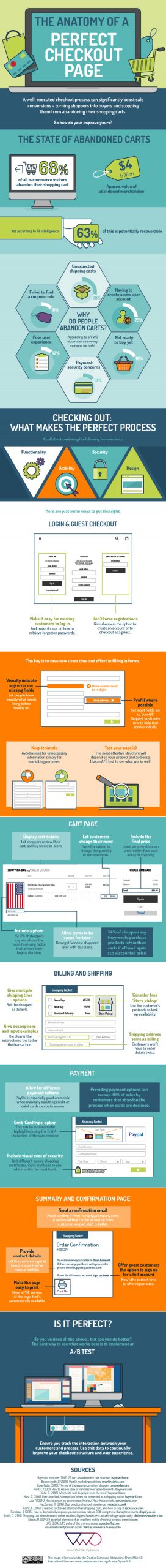
If you sell your wares online you’ve probably experienced this a lot. The ole “click buy” ditch – when someone gets to the checkout page of your store and just leaves all their purchases sitting there in their cart instead of buying them.

Research from Baymard Institute estimates that 68.5% of all online purchases get abandoned at checkout. So, how do you stop this from happening?

By ensuring your checkout page is easy to navigate and user friendly of course! Customers get frustrated by a myriad of things that means they click away instead of clicking buy such as being presented with unexpected costs (shipping, tax etc.), having a bad user experience and payment security concerns.

All of these issues can be addressed by you, the e-commerce store owner and we’ve found a handy infographic by the people at VWO to help you create the best checkout page possible and therefore lessen the “click, buy” ditch!

1441123420-the-anatomy-of-a-perfect-checkout-page

Connect with us

Categories

Let's work together

Ready to accelerate your online business growth? Get in touch and let’s make it happen together.