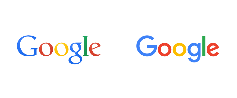
So Google have changed their logo from their well known serif wordmark font to a san serif typeface!
Why did they change?! WHAT HAPPENED?!
Well there’s a few reasons, and it’s not just about updating their look to conform with the recent san serif trend, although we guess that had something to do with it.
Google was developed for desktops and with the recent explosion of devices (laptops, tablets, phones, watches, fridges, cars, gaming devices) it was time they upgraded their logo to be more user friendly across all the available platforms. This change in font makes it easy to read no matter if you’re viewing it on a your car’s dashboard or a 30 inch computer screen.
It’s also been animated, so that when you’re doing a voice search and say “Okay Google” it changes into dots, and then the dots change to an equaliser as it listens to what you say and then as it’s finding that you asked it for the dots come back and whirl together and then your answer shows up, which is when the dots turn back into ‘Google’.
This reflects the movement that Google wants to re-encapsulate that they are not a static company that a lot of people think of them as. Their explorations of late; self driving cars, space and virtual reality goggles for your phone (Google Cardboard) prove that they are an ever evolving, adaptive and innovative company and this animation of their logo is being used to further re-cement that idea in people’s minds.
This change in logo also reflects their change in ownership. Google and some of their other companies (Calico,Google Ventures, Google Capital, Google X, Google Fiber, and Nest Labs) have recently been taken over and changed into a holding company called Alphabet, which is run by co-founders of Google Sergey Brin and Larry Page, and has been introduced to ensure that all the different Google products stay as products instead of amalgamating into one big giant thing which is what was happening to Google.
Basically Google was losing some of it’s brand recognition, and so by splitting up it’s companies between Alphabet and Google Inc. (which is keeping control over all their Internet-related businesses) it will ensure that the Google Inc. brand stays strong and focused, and means that they will be able to experiment more with the companies currently under Alphabet and we’re sure – the many more to come.
The Google logo has been altered to relate to Alphabet’s own logo, it uses a very similar font and as such, ties in with the new takeover.
https://upload.wikimedia.org/wikipedia/commons/7/7a/Alphabet_Inc_Logo_2015.svg
Some people are saying that this new logo is reminiscent of so many other companies logo change, such as Microsoft, Twitter and Facebook in the way it’s gotten rid of extra curves and detailing, others are completely non-plussed, some (of course) hate it and others love – but isn’t that the way with everything?
Our opinion? The changes behind the logo are the most important, they are the ones to get excited about!
